


12,288 faces of one logotype
Seven letters, twenty-seven drawings, morphing between them, and the two mistakes I made before it stopped stuttering.
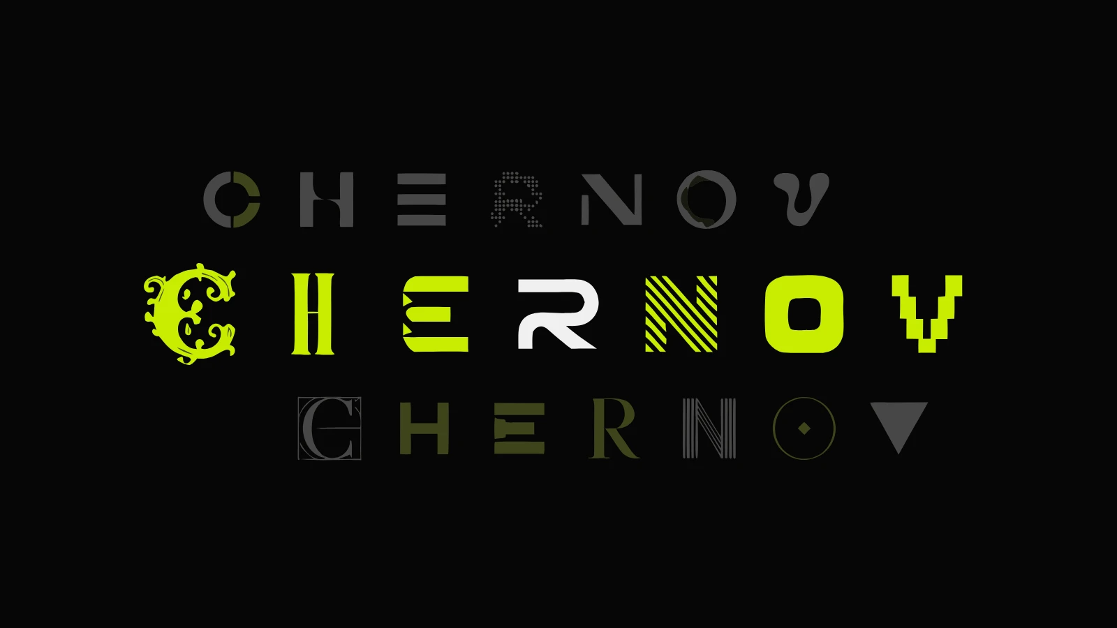
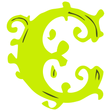
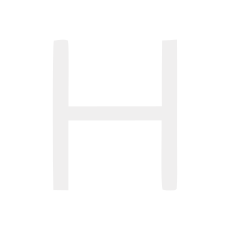
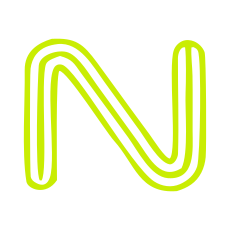
The logotype in the header of this site does not sit still. Each of the seven letters in CHERNOV is drawn in several characters: strict, pixel, baroque, Victorian, op art. Twenty-seven drawings in all. Every few beats one letter decides to become another one, and it takes its time about it: the shape flows into the next shape like liquid.
The word is my own name, Alexander Chernov, so nobody but me could be annoyed by the experiment. Here is how it works and where I got it wrong.
Why the crossfade version was dead#
The first attempt simply crossfaded SVGs. It worked, and it was dead. A picture swap reads as a glitch. What makes the logotype alive is the trajectory: the eye gets to watch how a strict serif turns into a pixel grotesque, and it fills in the character of the letter on its own.
The morphing runs on flubber, a path interpolation library. You cannot feed it raw letters, and that is where the detail starts.
The holes#
The letters e, o and r are paths with holes in them. Naive interpolation of the outer contour welds the hole shut, and halfway through the transition the letter turns into a blot. The fix took a while: break the path into subpaths, match them between drawings by a heuristic (fill color, area, distance between centroids), then morph subpath to subpath with fill-rule: evenodd so the holes stay holes the whole way across.
The spare shapes#
In one drawing a letter is made of two shapes. In another, five. The three spares have to go somewhere, and hiding them shows. Flubber has combine and separate, so the spares grow out of their neighbors or dissolve into them.
The rhythm#
Morph every letter at once and you get fireworks. Morph on a timer and you get a metronome. Both are boring, so the logotype has a conductor. A solo letter changes every 2.8–4.6 seconds, and every five to seven beats a wave rolls across the word with a 110 ms stagger. On top of that the scale breathes a little, so the word is never stone, even in the pauses.
The performance zone#
In the footer the logotype belongs to the visitor. Hover a letter and it changes character. The combinations come to 4 × 4 × 4 × 4 × 4 × 4 × 3 = 12,288. A counter at the bottom keeps an honest tally of how many you have seen.
Why bother#
A logotype is the most frequent point of contact with a brand and usually the deadest one, a picture nailed to the corner of the screen. I wanted a designer’s signature to behave like a designer. It cannot sit still, and it knows when to stop. Motion without a job is decoration. This one has a job. The logotype shows range, and range is what a portfolio sells.
Motion design answers one question. What character does this thing have? How to move it prettily comes second.
The technical part is short. Flubber weighs 13 KB, morphs on requestAnimationFrame with easeInOutCubic, and shuts itself off completely under prefers-reduced-motion. The letters were drawn in Figma, cleaned down to plain paths, and live as separate SVGs, four variants per letter. The v has three. It has not earned a fourth.
Next in the journal
Eight case pages in one night, built by an orchestra of agents