






A folder of double exposures I have carried since 2014
Nine pictures that outlived every trend in my feed, and what the two-frames-in-one trick teaches someone who draws interfaces.
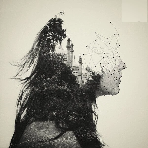
Every designer has a folder that moves from computer to computer longer than any project does. Mine is a folder of double exposures from 2014, collected for an old blog. I am Alexander Chernov, I have drawn interfaces since 2005, and this folder has outlived most of what I drew.




Why the trick refuses to die#
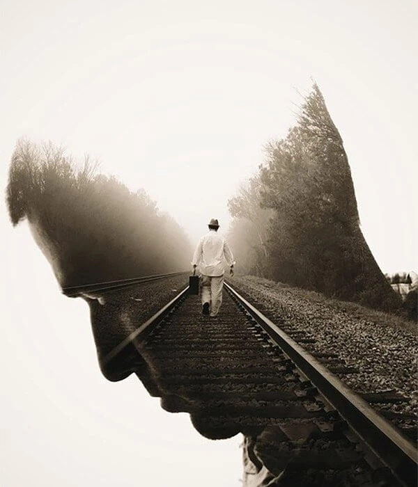
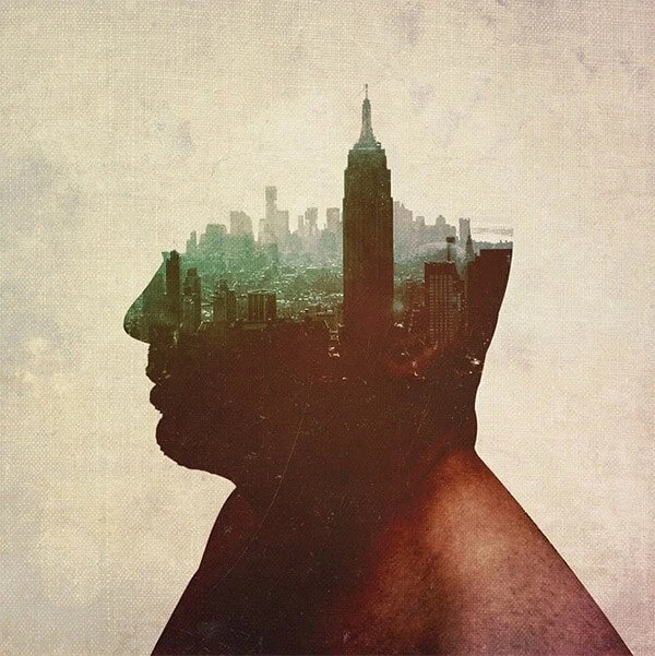
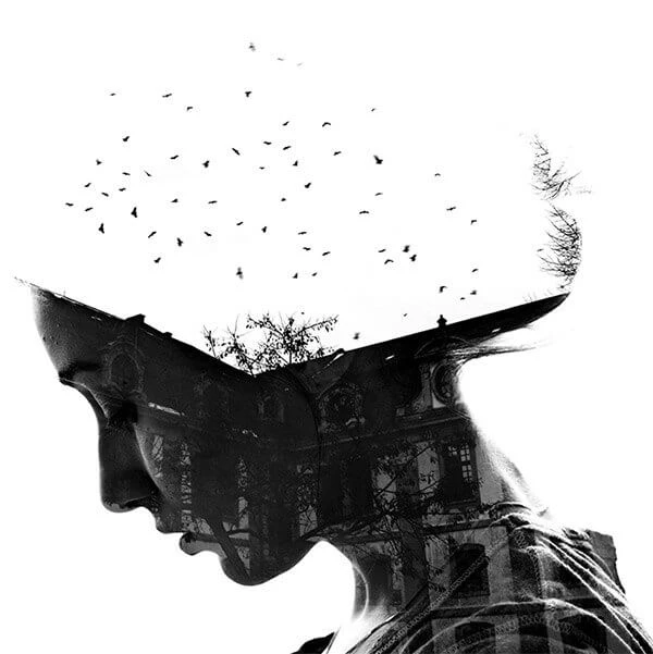
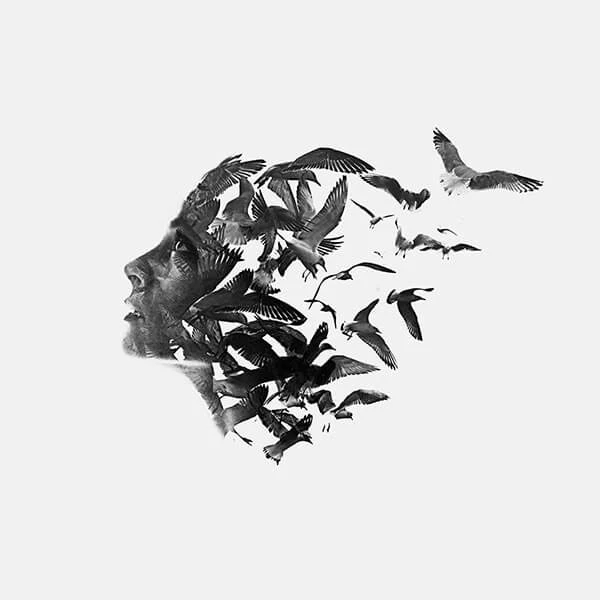
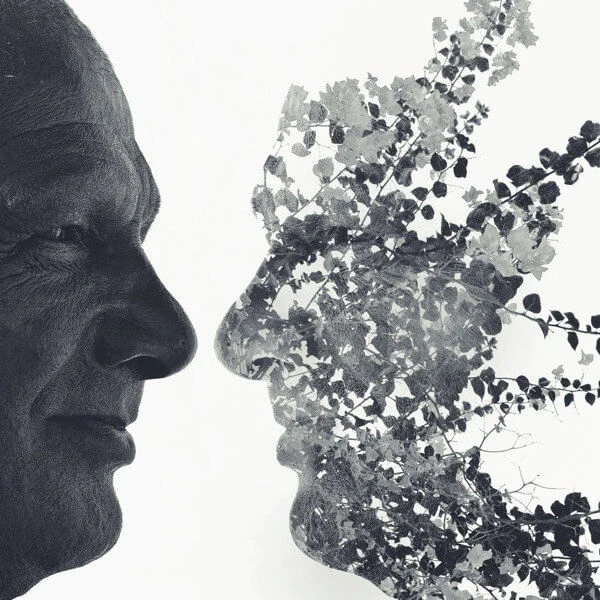
A double exposure is a metaphor made out of light. The two images argue with each other, and the meaning turns up on the seam: a person and a city, a person and a flock of birds. The viewer finishes the story, and whatever a viewer finishes, they own and like more.
Interfaces get three lessons out of it.
Every layer works twice#
In a double exposure nothing is only background. Every pixel serves both stories at once. A good screen works the same way, and the chart in a trading terminal is data, navigation and the state of the portfolio in one object. An element that tells only one story probably does not need to be there.
The silhouette beats the detail#
The trick holds up on a hard, readable outline, and taking the silhouette away leaves mush. In an interface the silhouette is typographic hierarchy: the mass and the outline first, the detail after.
The seam is the interesting part#
All the tension sits where the two images meet. In a product those are the joints between flows: onboarding into the first screen, search into a result, an error into recovery. We polish screens and abandon joints, and the user lives in the joints.
The lessons came later, by the way. I carried the folder for years before I tried to explain why it worked, and the explanation may be a rationalization of nine pictures I simply liked.
Inspiration is stealing the principle and forgetting the picture.
The pictures can stay, though. Twelve years on, the folder is still with me.
Next in the journal
Three books I recommend instead of a course